Roles: Designer, Researcher
Duration: 3 months
Technology: Figma, Photoshop
Roles: Designer, Researcher
Duration: 3 months
Technology: Figma, Photoshop
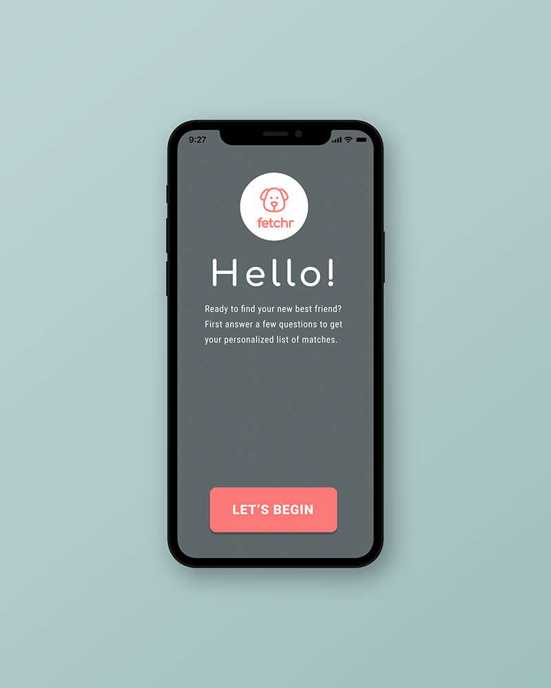
A mobile application design made for individuals who may be seeking to adopt a dog from a local shelter.
The tool empowers users to make informed decisions when selecting adoption candidates that are better suited to their own lifestyles.
Approximately 47% of re-homed dogs were done so citing "problematic behaviors," which could be caused in part by a lack of the owners’ prior knowledge/experience in canine breed behaviors and training. Additionally, this focus on a dog’s readily observable aesthetics has ultimately resulted in the emergence of a related problem — overrepresentation of less "popular" breeds within shelters, further perpetuating the stigma of these particular breeds as being "un-adoptable."
Due to the relatively broad scope of this issue, it was necessary to limit the the geographical parameters of research in order to better investigate the specific nuances of the problem at hand. Thus, the city of Baltimore was chosen specifically due to its particular history and legislation regarding dogfighting and pit bulls, one of the most stigmatized types of dogs currently.
My primary aim was to create a solution that was both interactive and personalizable to help individuals who may be seeking to adopt a dog from a local shelter. This application aims to empower users to make informed decisions when selecting adoption candidates that are better suited to their own lifestyles.
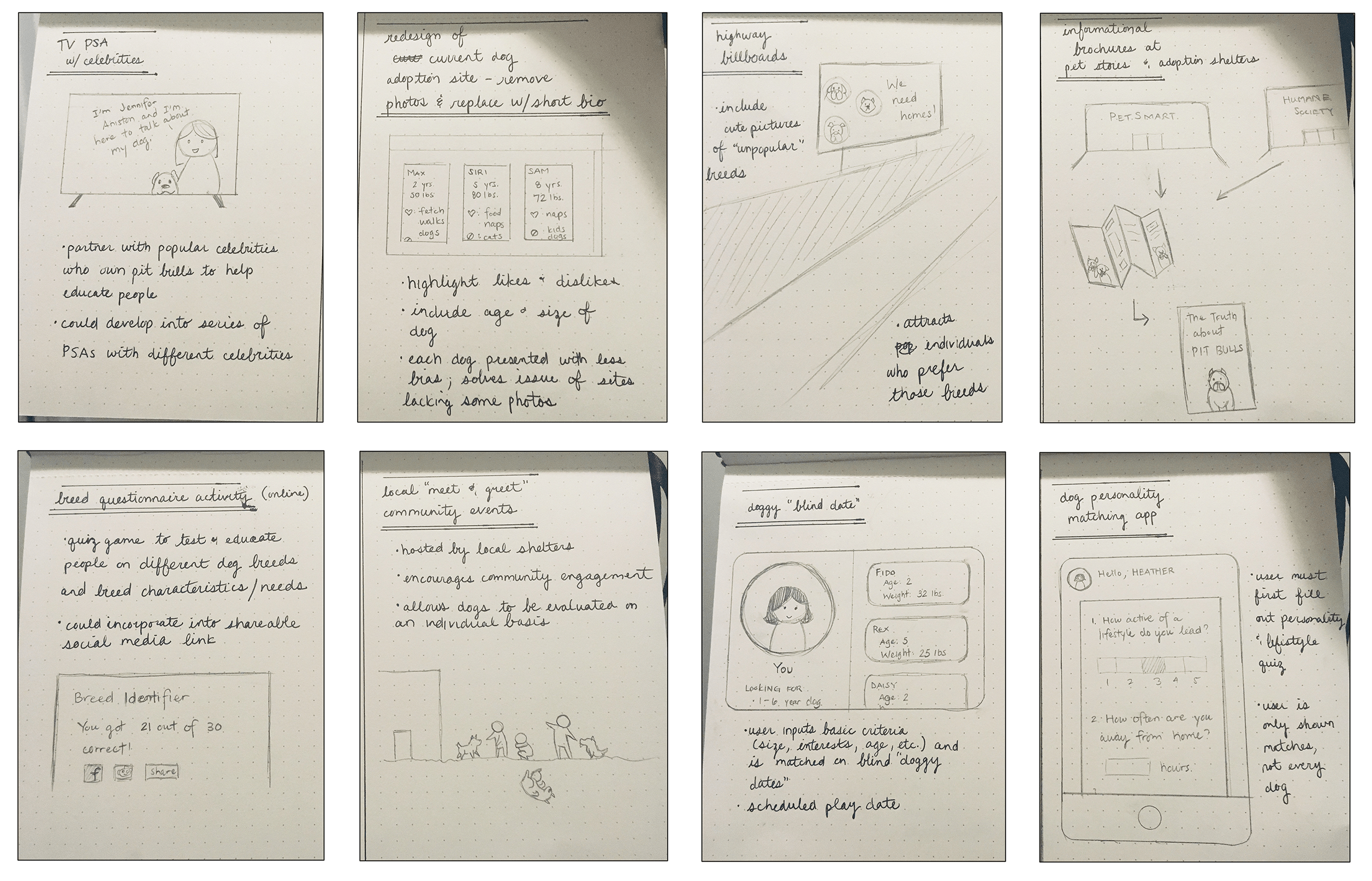
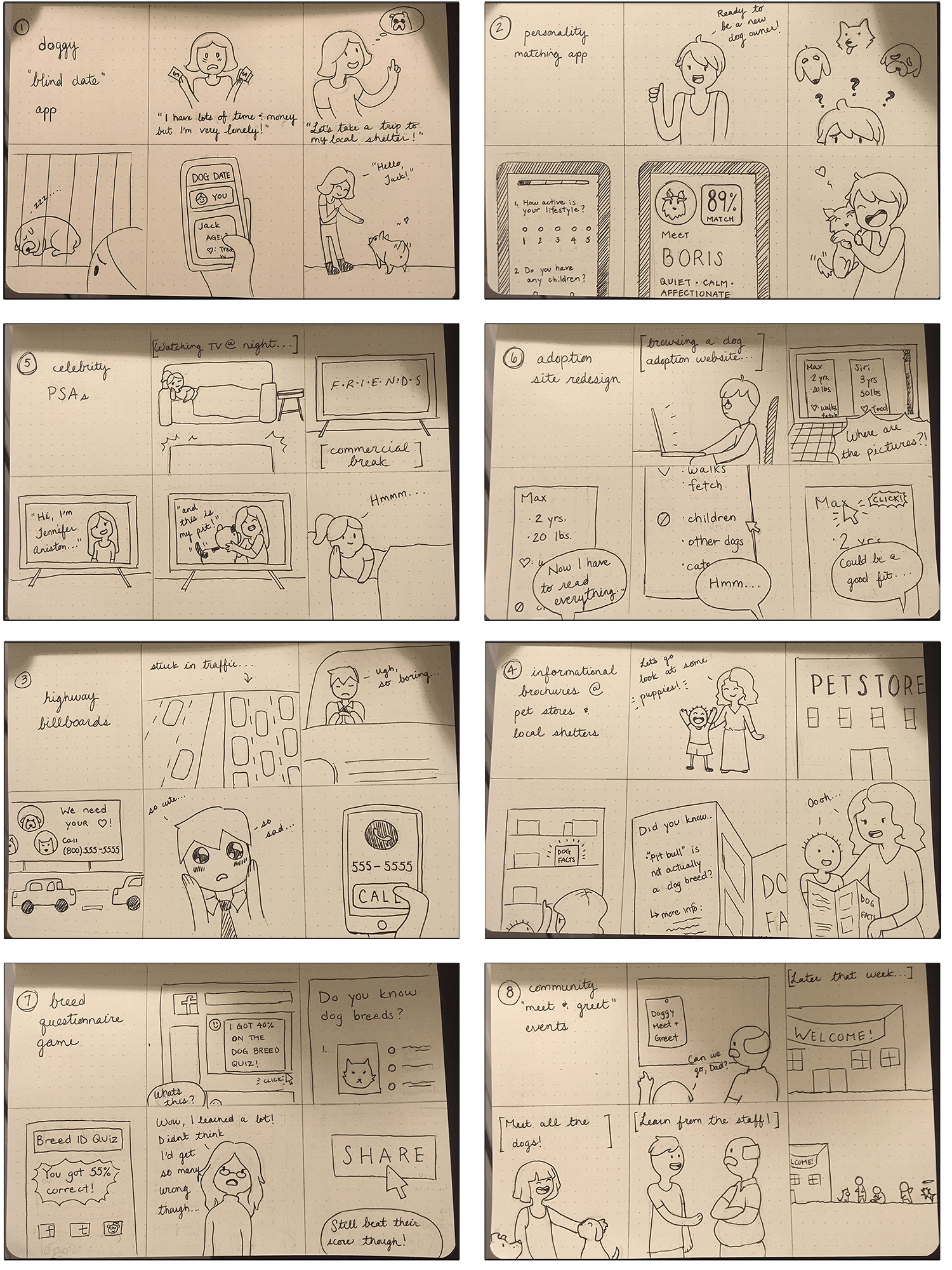
To begin addressing the issue, I initially started with sketches of 8 potential solutions. I included both digital and non-digital solutions to avoid restricting ideas prematurely. These ideas were then expanded upon using storyboards to flesh out their respective pros and cons. Ultimately, I wanted to explore in detail how the strengths of each particular solution might be incorporated into other ideas.
Ultimately, I went with a mobile app solution as a modern, accessible solution. The app re-prioritizes information regarding local shelters' adoptable dogs and weights adoptable candidates based on their compatibility with the user's lifestyle and presents this information in a way that is relevant, informative, and memorable.
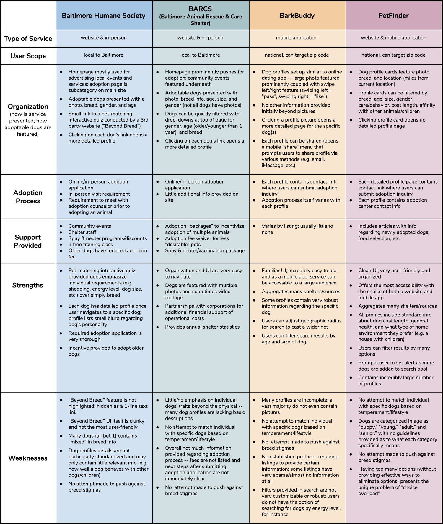
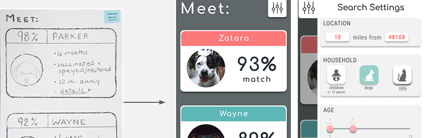
A preliminary competitive analysis of four dog adoption tools found that in 3 of the 4 services, dog profiles were all presented initially with photographs, but very little additional information. Additionally any info presented did not appear to be standardized — some adoptees had extensive profile write-ups while others were missing profiles entirely.
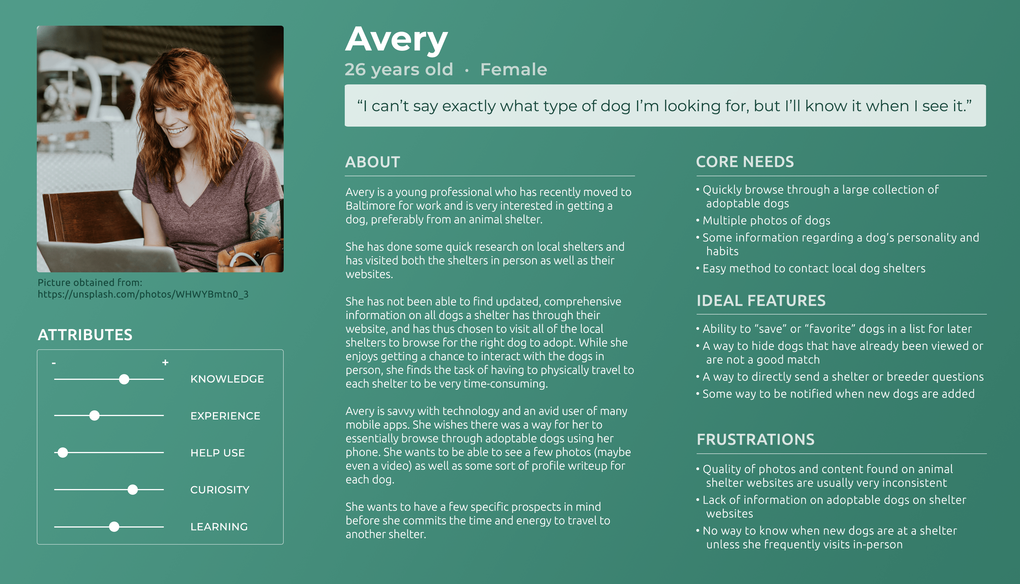
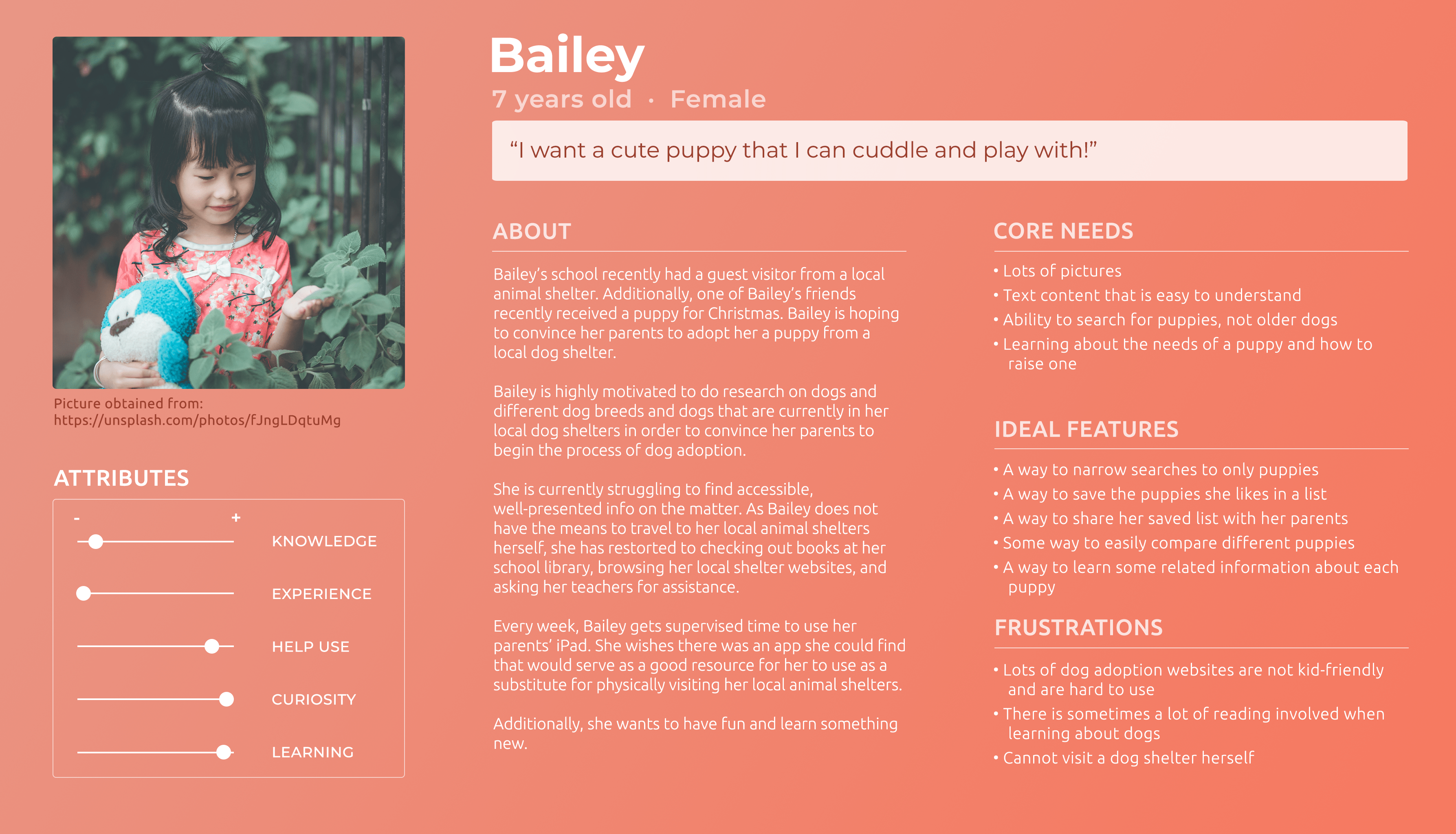
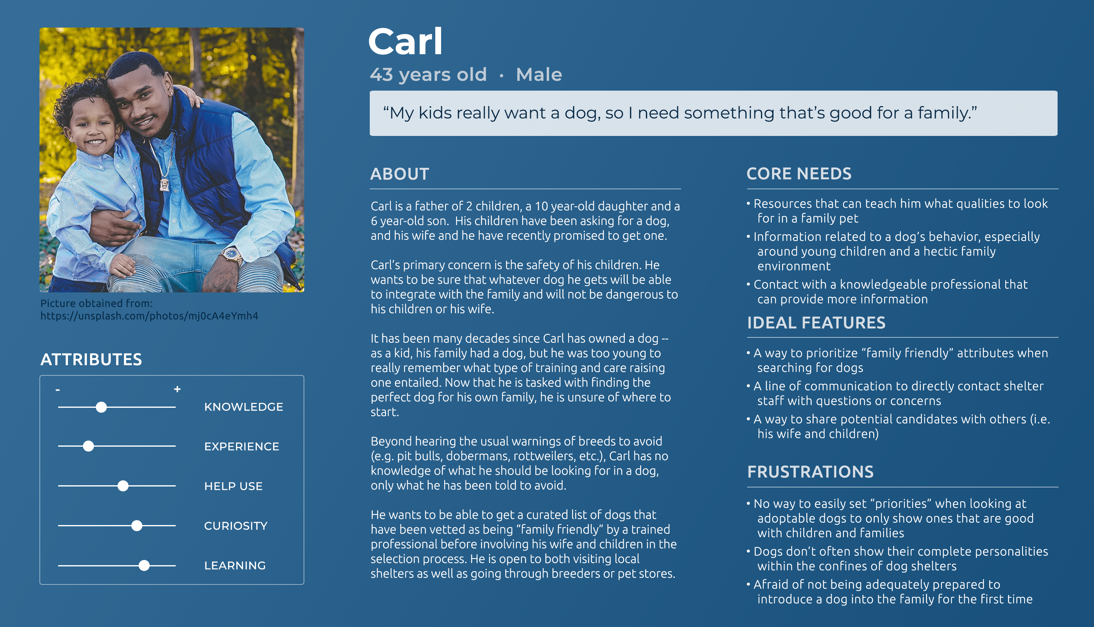
Since there are existing applications out there with a comparable service, I wanted to delve deeper into the specific demographics for whom my design would be intended. Based on my previous online research as well as in-person interviews, I created 3 personas to organize and highlight potential users motivations and pain points with existing solutions.
After analyzing my findings, I created a paper prototype to test my application quickly and identify any flaws in the design and/or user flow itself. Users were tasked with both observing a demonstration of the paper prototype's usage as well as interacting with it themselves. They were then interviewed about the process.
"I liked the pictures showing the sizes of the dogs next to a person."
"I like that you can see how many matches there are with each question."
"I don't understand what the 'percentage match' really is. Like, what does a 90% match mean?"
"If I have [an] 85% match versus [an] 88% match, what's the difference?"
"Can I go back and change my answers to questions if I change my mind?"
"What if I don't know what I want [with regards to an answer to a question]?"
I realized that could look to finding #1 to address the issues brought up in findings #2 and #3 and provide solutions that would leverage an aspect of the design that users had already found valuable.
The biggest challenge in this regard was to find a way to show users how a percentage match translated to a breakdown of their own preferences. Ultimately, I opted to add a radar chart to the dogs' detailed profile pages, as all of the questions presented to the user could be sorted into one of five categories – size, energy, trainability, shedding, and barking.
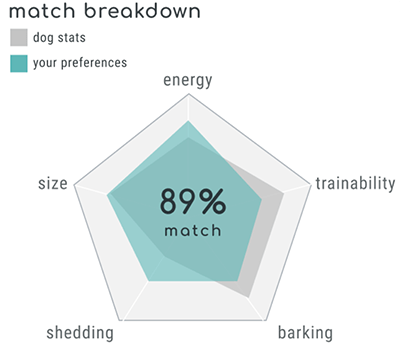
By observing the overlap in the diagram, users can view their own preferences at a glance, as well as exactly which criteria they most closely align with (or not) with each dog.
I wanted to offer an easy but thorough way for users to change any answers they gave in the questionnaire. This meant that they would never be required re-take the questionnaire in its entirety, as users had indicated during the user testing phase that although the questionnaire was thorough, they also found it to be somewhat long and requiring some effort to complete.
I decided to add a detailed preferences submenu in the match results screen to allow users to both view and update their saved questionnaire responses.
A prototype was created using Figma and its key interactions and features were presented to a collection of my peers.
Account creation: How does the flow for a returning user differ from that of an initial user? Would adding an account registration process negatively impact adoption rates and make the application less accessible overall?
Increased transparency: How are matches between users and dogs made? Is this an area about which users are curious? Would a better understanding of the matching algorithm further empower users to make informed decisions?
Usage habits: If this an application that is intended for a user to utilize multiple times, how can notifications be presented in a helpful and unobtrusive way?