Roles: Front-End Developer, Interaction Designer, Interface Designer
Duration: 9 months
Technology: Photoshop, XD, JavaScript, HTML, CSS, PHP, MySQL
Roles: Front-End Developer, Interaction Designer, Interface Designer
Duration: 9 months
Technology: Photoshop, XD, JavaScript, HTML, CSS, PHP, MySQL
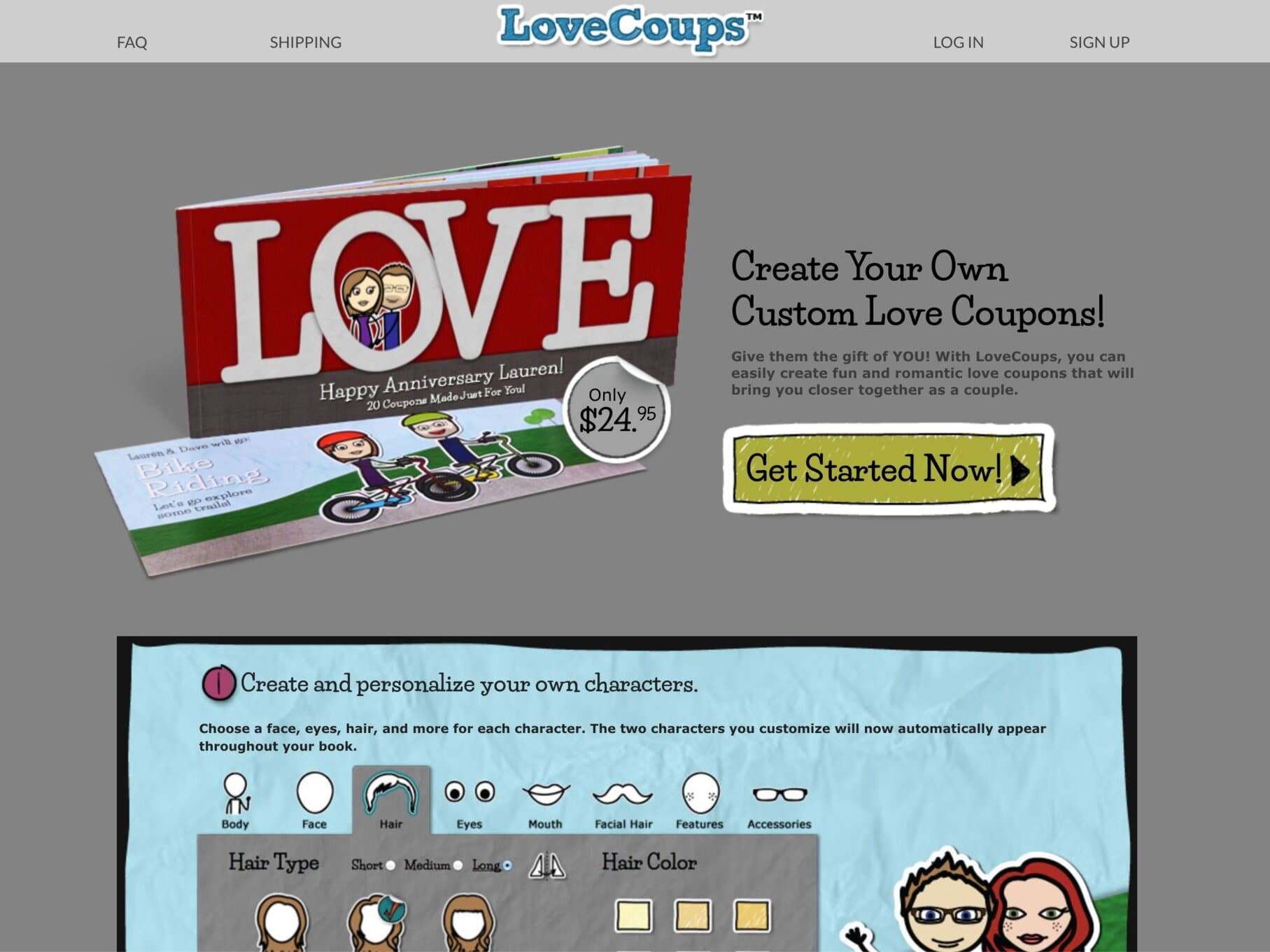
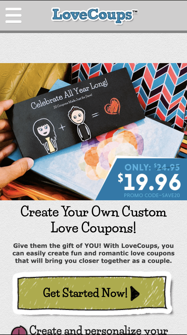
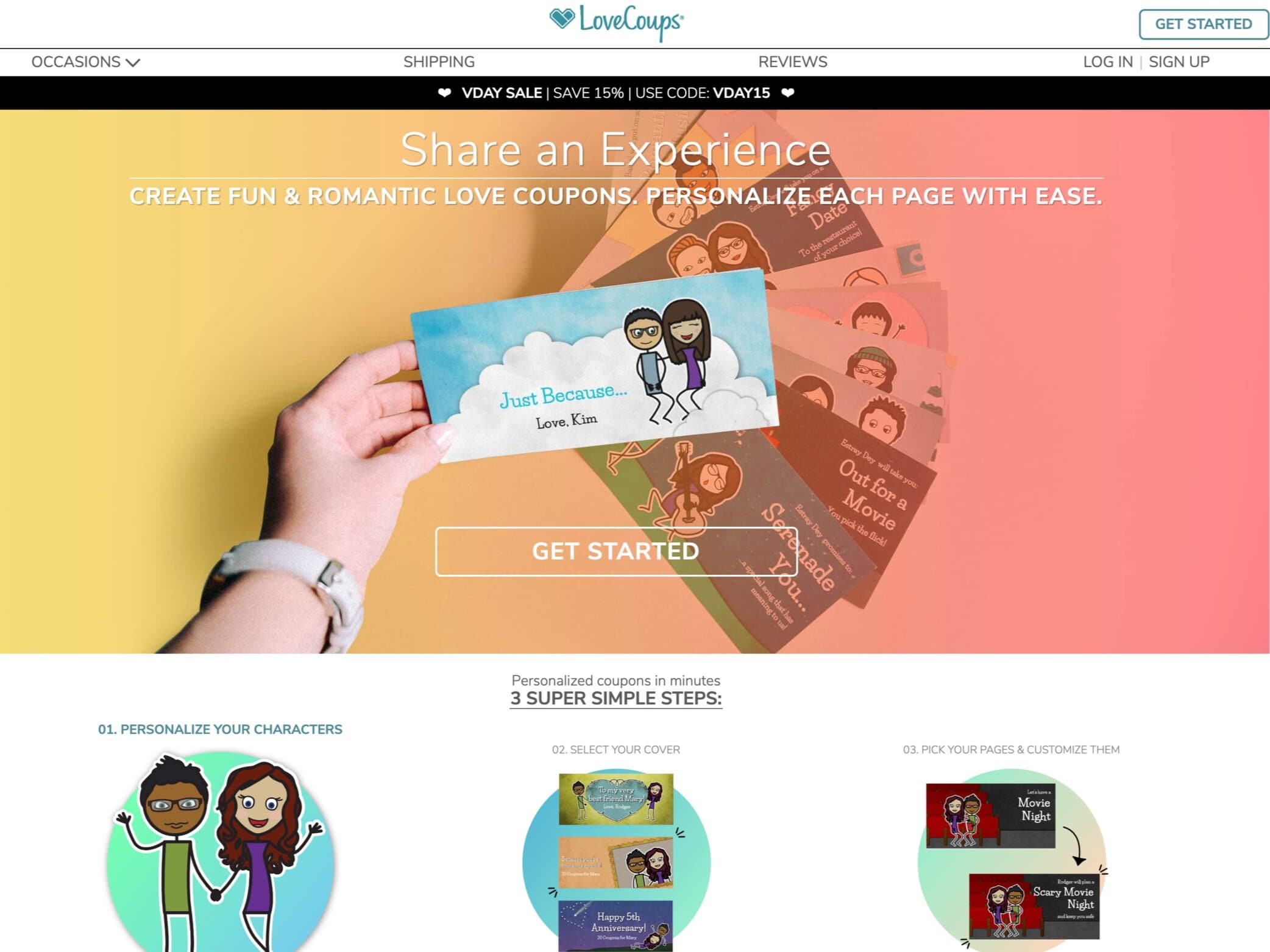
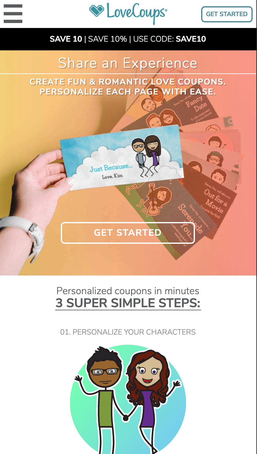
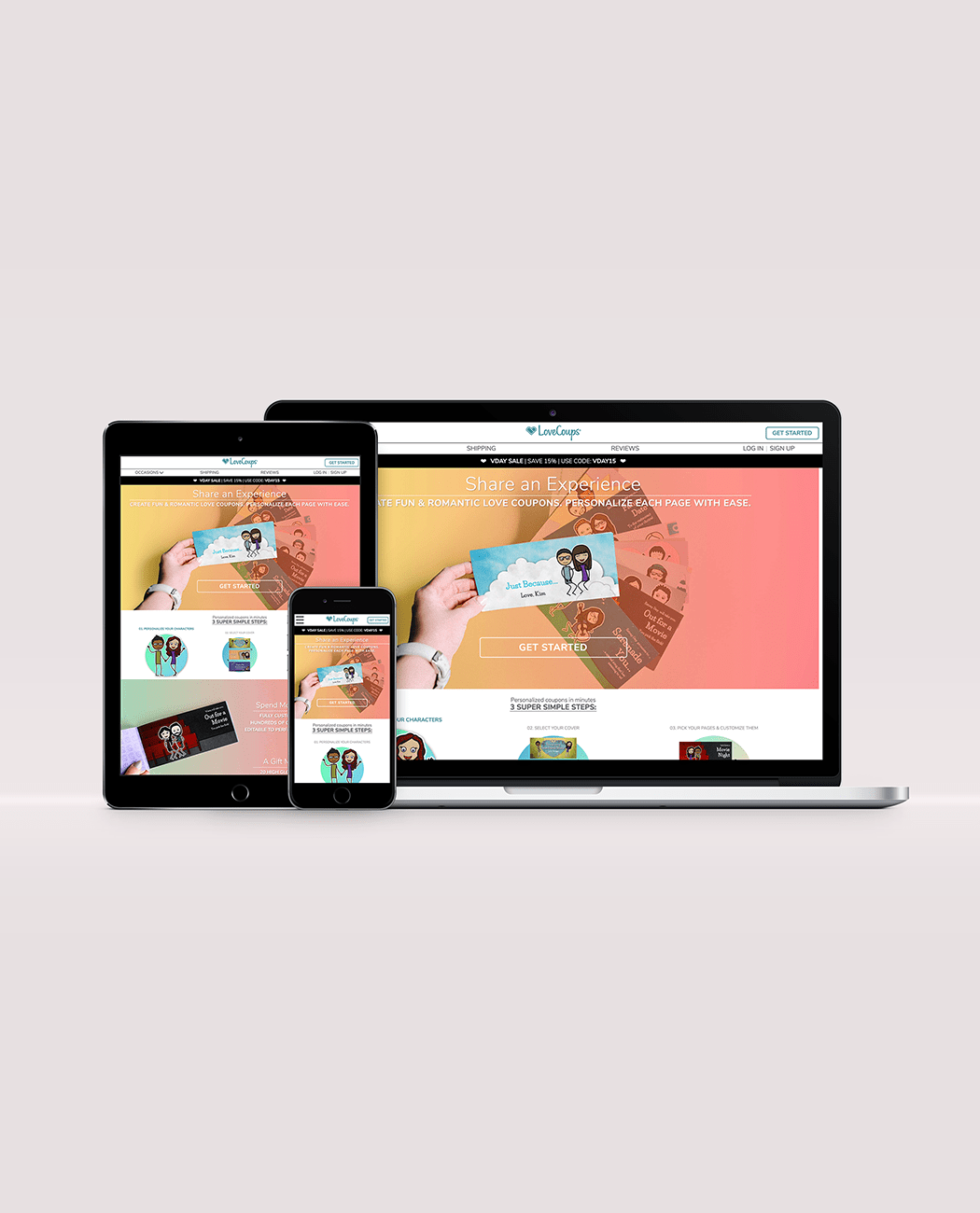
While working at LoveBook, I was tasked with the relaunch of the LoveCoups brand, based on guidelines and mockups provided by the graphics team.
Visit the live website here.
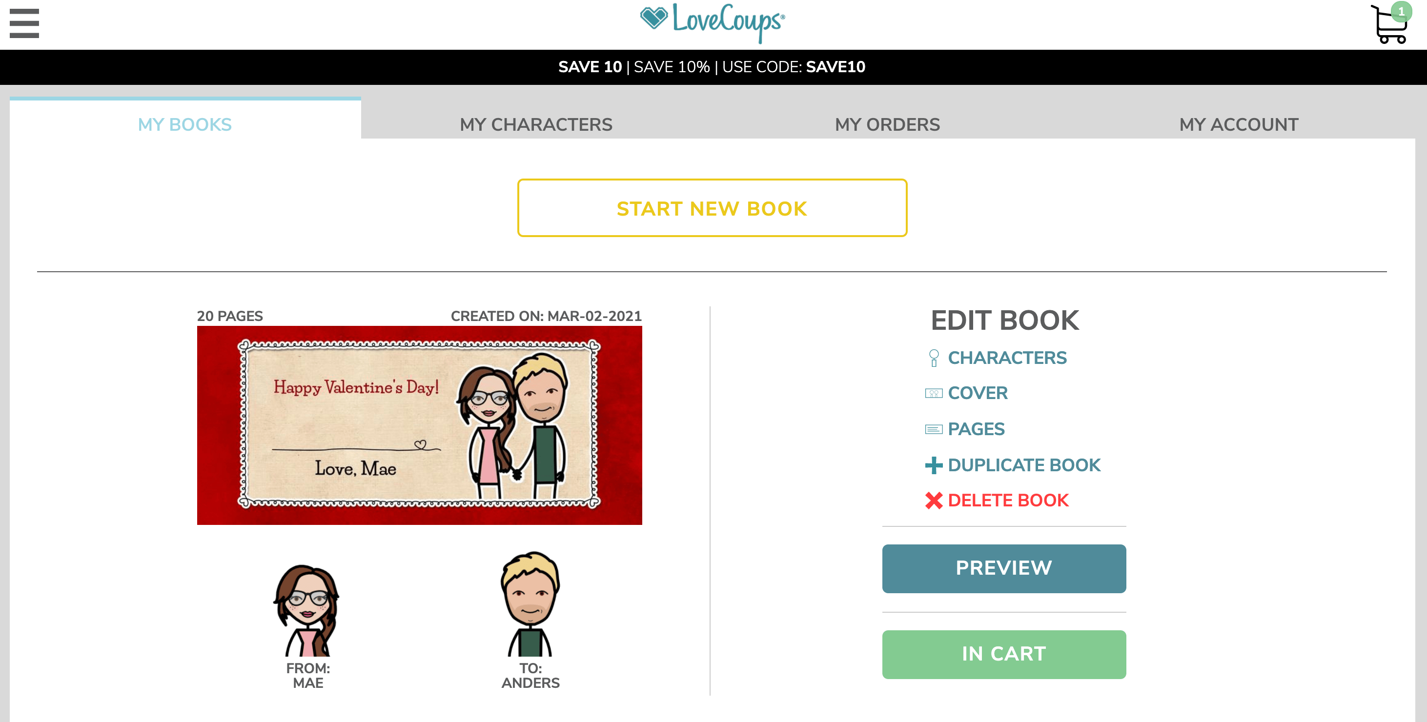
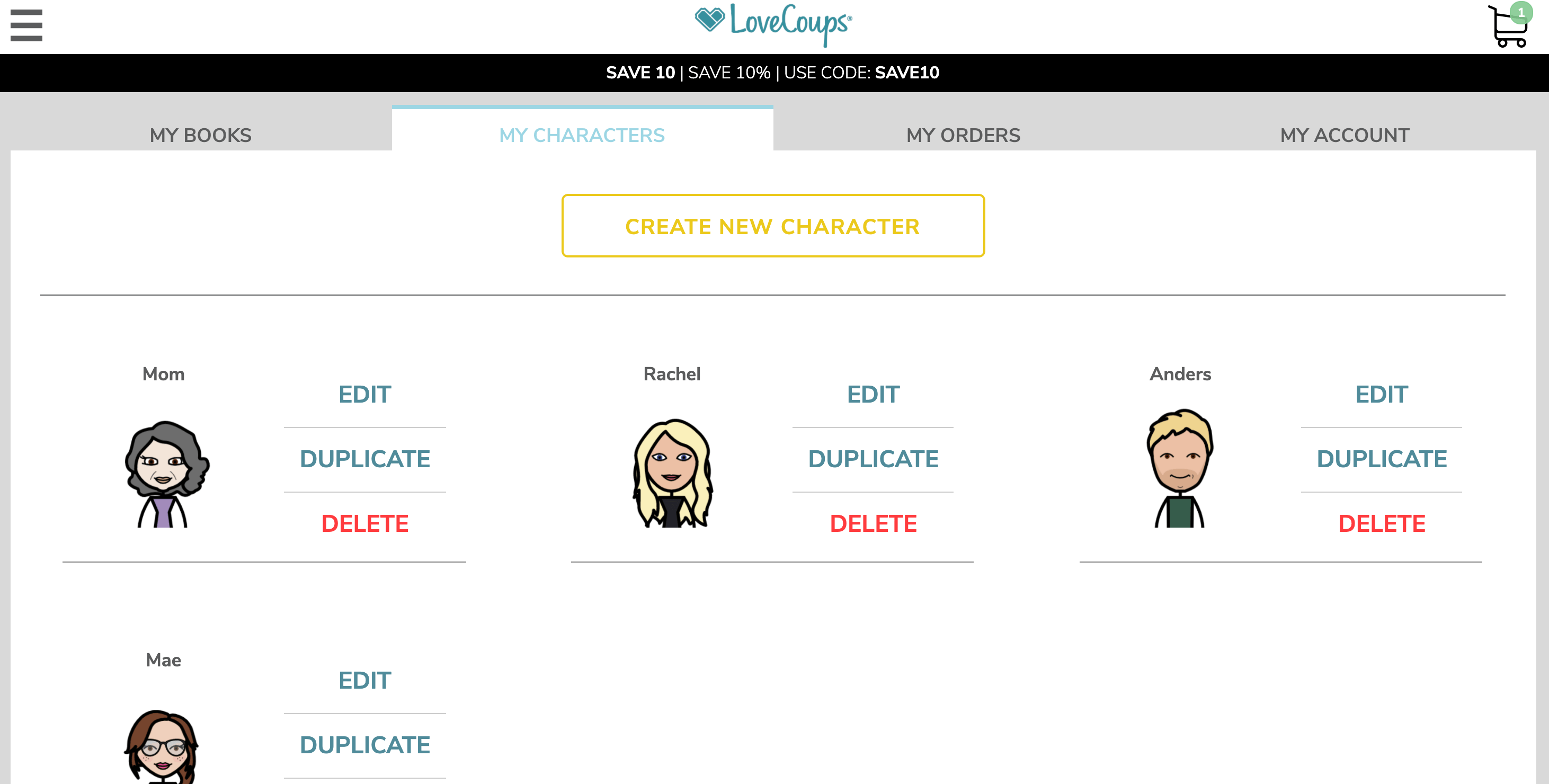
In the original website, the ‘My Books’ page was used as a crossroads for users to access both their coupon books as well as their characters. It soon became apparent that the ‘My Books’ page was the page most frequently linked to from other pages. However, orders and account information were housed separately on additional pages. Since all coupon books, both incomplete and previously purchased ones were all featured in the ‘My Books’ section, it made more sense to extend ‘My Books’ to serve the more generalist purpose of an internal “homepage” for users to be able to access not only their books and characters, but their order history and website account settings as well.
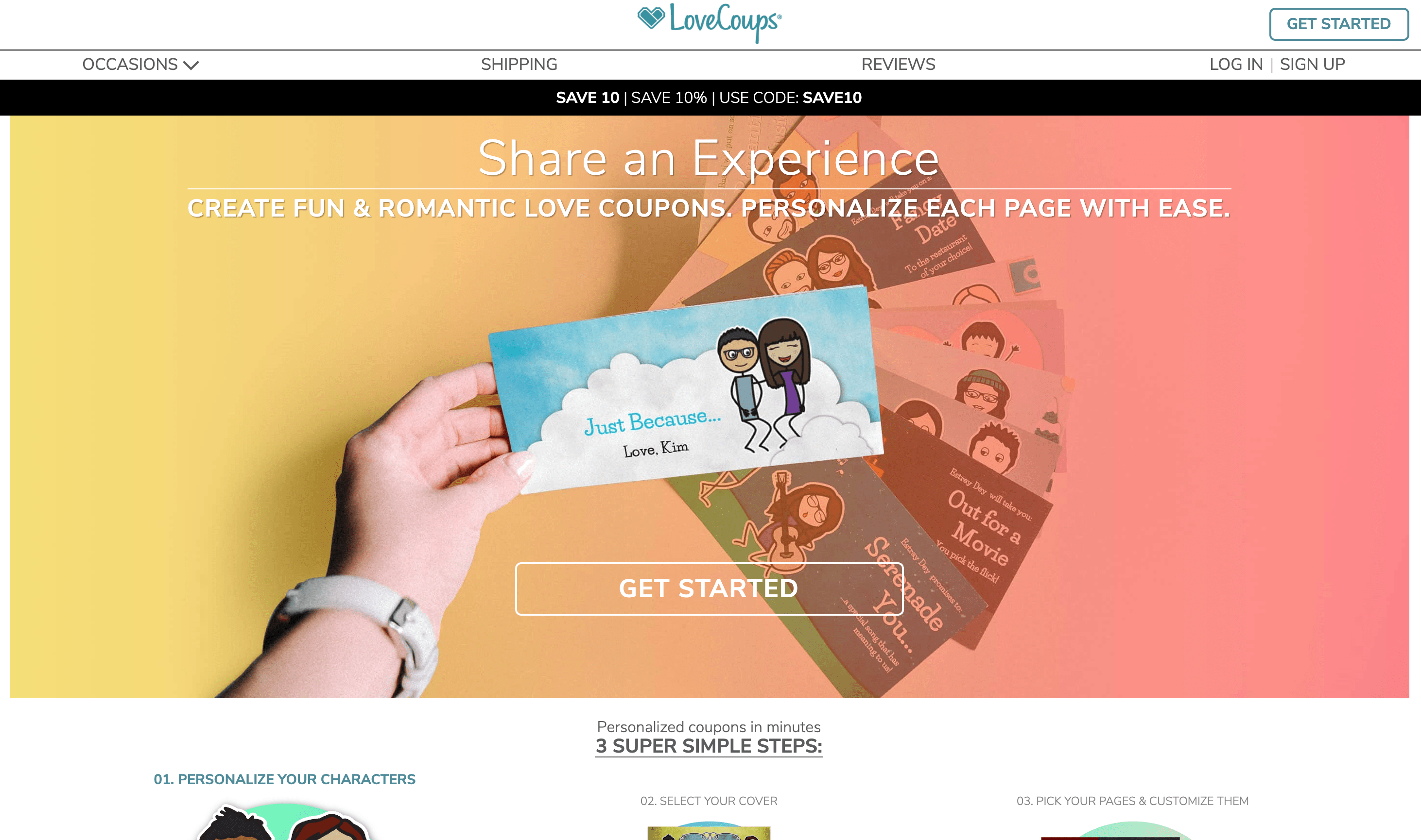
On the original website, there was a general lack of hierarchy with the navigation links on the main page. After discussion with the company’s customer service team, it was discovered that placing page links to the FAQ and Shipping pages first would sometimes distract or confuse new users, when ultimately getting them to sign up for a LoveCoups account should always be the first step in the user flow. Once users were engaged in the process of creating their avatar characters, they were much more likely to continue exploring the website’s features.
For this reason, less important content, such as the FAQ page, were relegated to a footer link. A ‘Get Started’ button was added to the top-right corner of the landing page, serving as another path for users to reach the login/sign up stage.
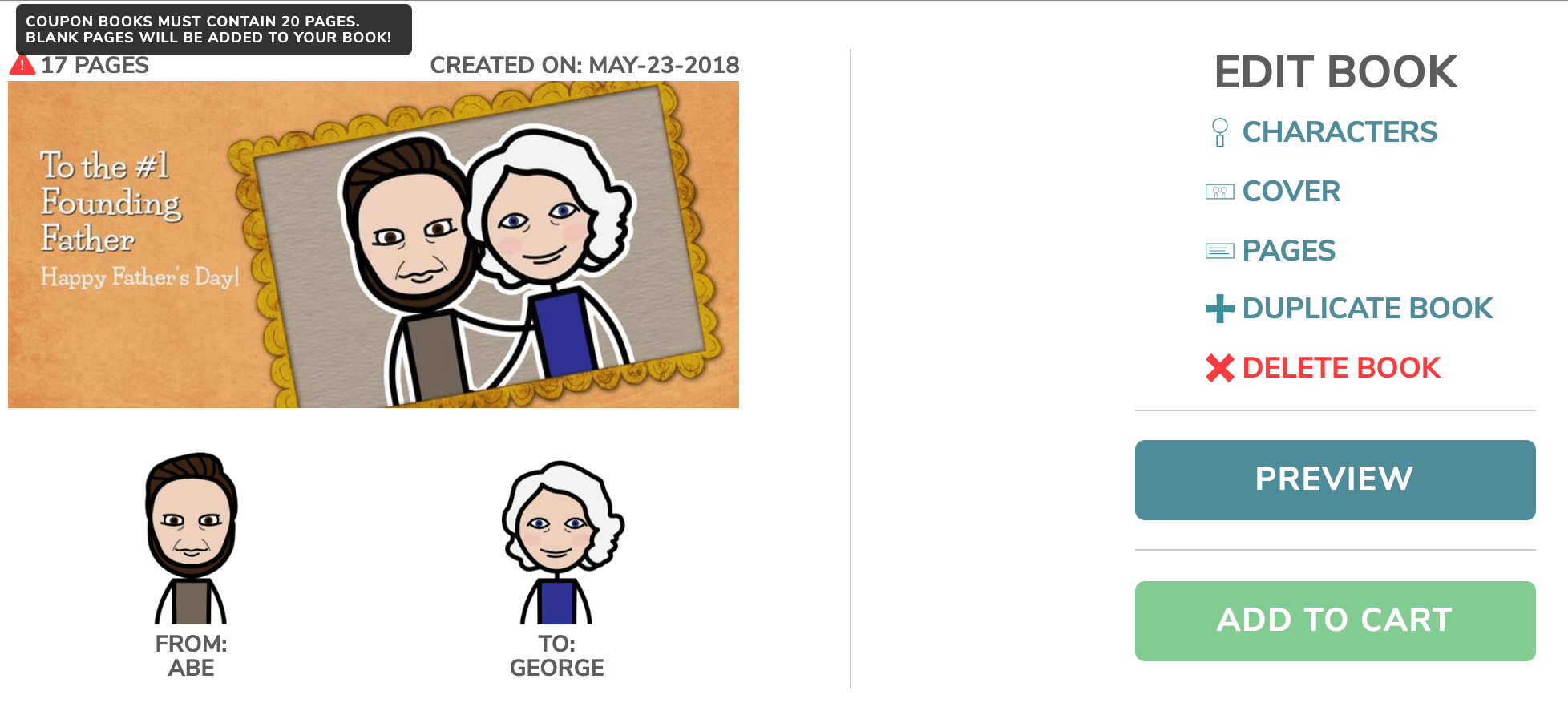
As there were multiple possible interactions and states that any coupon book could have (e.g. incomplete, already purchased, etc.) the challenge within the ‘My Books’ page was to present all this information in a way that was easily understood by the user while at the same time encouraging them to complete the creation and purchasing processes. By using descriptive icons and color-coded interactions (green for purchasing, teal for book editing-related options, and red for warnings), portions of text could be parsed down to the bare essentials, allowing users to glean more information quickly.
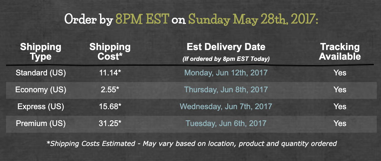
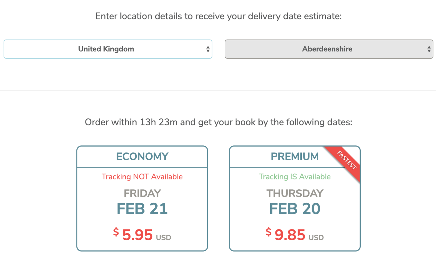
For the company’s customer service team, customer questions regarding shipping was an issue they faced often. While the original website had a small, information panel on shipping time calculations, it often varied wildly based on the destination country. On the updated shipping page, an option was added to allow users to input their location first in order to see anticipated shipping times. Shipping options were presented in a way that made shipping type comparisons much easier to perform.